Adobe Fresco, Illustrator, Photoshop, Vector Art

Psychedelic show banner

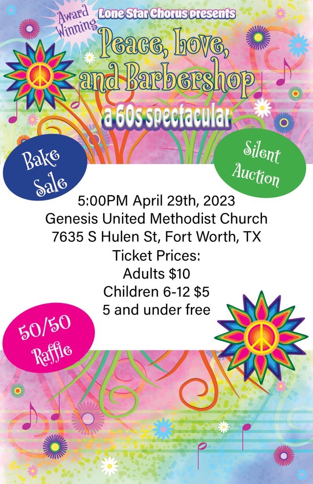
My latest project was developing a digital banner for Lone Star Chorus’ “Peace, Love, and Barbershop” show announcement. I had fun with this one, and used Adobe Fresco (for the water color background and grass), Adobe Illustrator (for the sun and notes), Adobe Photoshop (for the botanical layers), and finally Adobe inDesign to make a manageable file size. I flip through the apps because each one has a specialty and it is easier to do certain elements in different apps. Not only do I keep familiarity with each app with regular usage, I also see which app works better to execute my ideas.

Rainbow botanical musical banner

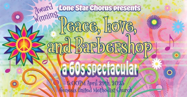
The banner is sized at 1920×1005 pixels to optimize for use as a Facebook event. To make a printable flyer, I played with the elements to make a lower coordinating panel, leaving a white section in the middle for readability.

1/2 page coordinating flyer
Adobe Fresco, Inktober52

Stone

I am continuing to expand my skills with Adobe Fresco using Inktober52 prompts. This week’s prompt was “stone”. We have many beautiful stone walls around town, so I did a photo tour, taking a variety of shots of stone, then picked the one that pleased me the most. Rather than manipulate the photo this time, I did a translucent layer over the photo layer. I cast a tan color over the background (one of our native stone is an ochre color), then erased bits for the letters and added white and gray to make the them stand out.

Cropped original stone wall picture
“Stone” graphic created in Adobe Fresco
Adobe Fresco, Inktober52

Spooky

This week’s prompt from Inktober52 was “spooky”. My idea was to have the word spooky written out in tree branches, starting with one of my own photos. In Photoshop, I would have approached this using the clone tool. Adobe Fresco has a multi-color eye dropper tool that can be used somewhat like a clone tool, but it wasn’t working for this project. Instead, I found that using a pixel brush with a basic hard tip size 6 would make small circles. If I reduced the flow to give some transparency, and used the Apple pencil to make overlapping dots, it mimicked the light coming through the branches well. I used a separate layer to write the word to use as a guide, then worked the dappling magic around each letter before darkening the centers with a larger brush size. I restarted this image four times before finding a technique I wanted to use!

“Spooky” photograph manipulated in Adobe Fresco with an Apple Pencil
Adobe Fresco, Inktober52

Golden Yin Yang

I’ve combined two weekly prompts again. This was purposeful, as “yin yang” can be styled to so many things. I was very excited about the prompt, as I believe life is about balance, and have seen and used this imagery for many years. My business logo even incorporates a version in the background for the air and earth.

Caryn’s Creations logo

I even have photos of my cats and dogs forming yin yang poses.

Dogs as yin yang
Cats as yin yang

So I waited for the next week’s prompt, which turned out to be “golden”. Hm. Golden yin yang. I do need to work on making things look gold, so the prompt is helping me develop my skill set for certain. I used Adobe Fresco again, and made heavy use of soft, semi-transparent pixel brushes.

Golden Yin Yang created in Adobe Fresco with an Apple Pencil
Adobe Fresco, Inktober52

Tranquil, Angel, Light

Yup, I combined three prompts this time. Rather than skip a week when things get busy, or struggle to play catch up, I float outside the box a bit and look at a different angle. I had some ideas for the prompt “tranquil”, then along came “angel” which focused the possibility field nicely (you were spared image of the angel with a tranq dart in the rump, you’re welcome), then time slipped sideways and “light” was suddenly the next prompt. I already had my reference photos for tranquil angel, and it wasn’t hard to imagine that it was the cat emanating the light. Done in Adobe Fresco on an iPad with an Apple Pencil, I did a sketch with a pencil brush, then used pixel brushes (“natural”) to lay down the colors using the sketch as a guide on a separate layer. I blended the colors at the end, since pixel brushes overlay, but don’t mix like the oil or watercolor brushes (about half-way through I realized I could have used oil brushes instead, but I was already committed).

“Tranquil Angel Light” drawing done in Adobe Fresco